


My favourite font.
----------
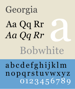
Georgia is a transitional serif typeface designed in 1993 by Matthew Carter and hinted by Tom Rickner for the Microsoft Corporation, as the serif companion to the first Microsoft sans serif screen font, Verdana. The initial version of the font was released on November 1, 1996 as part of the Core fonts for the Web collection. Later, it was bundled with Internet Explorer 4.0 supplemental font pack.
It is designed for clarity on a computer monitor even at small sizes, partially due to a relatively large x-height. The typeface is named after a tabloid headline titled "Alien heads found in Georgia." The Georgia typeface name is a registered trademark of the Microsoft Corporation.
The Georgia typeface shares many similarities with Times New Roman, though Georgia is noticeably larger than Times at the same point size. Times New Roman's characters are slightly narrower, having a more vertical axis. When one compensates for the size differences and disregards the differences in compression and spacing, the remaining differences are minimal. Overall, Georgia's serifs are slightly wider and have blunter, flatter ends, but on initial inspection many letterforms are difficult for a novice to distinguish between Georgia and Times New Roman. Figures (numerals) are an exception: Georgia uses text (old-style) figures whereas Times New Roman has lining figures.
Georgia was part of the core fonts for the Web package and is preinstalled by default on Apple Macintosh and Windows-based computers. It has found popular use as an alternative serif typeface to Times New Roman.
No comments:
Post a Comment